Picking a resume layout can indeed feel like an insurmountable hurdle for many job seekers. It’s a foundational decision that impacts readability, visual appeal, and ultimately, a recruiter’s first impression. With the plethora of advice and design options available, navigating this initial step can be overwhelming. Among the most prevalent choices are multi-column designs, often championed by resume builder tools, and the traditional no-column, or “single-column,” approach. A thorough comprehension of the individual distinctions, and critically, their reception by readers, is paramount.
The Enduring Power of the No-Column Resume
The no-column resume, often considered the traditional format, presents information in a straightforward, linear structure. All information is presented in a single, vertical ‘column’, flowing from left to right, much like a standard document or book. This layout emphasizes a clear, chronological progression of information, typically starting with contact details, followed by a summary or objective, work experience, education, and then skills.
The strength of the no-column resume lies in its simplicity and universal readability. There are no visual barriers or divided sections to navigate; the reader’s eye naturally follows a consistent path down the page. This eliminates any potential confusion about where to look next or how to interpret the hierarchy of information. For many, this traditional approach is perceived as more professional and straightforward, avoiding any design elements that might distract from the content itself.
A significant advantage of the no-column resume, often highlighted by career experts, is its compatibility with Applicant Tracking Systems (ATS). While ATS technology has improved, many still struggle to accurately parse information from complex, multi-column layouts. A no-column resume, with its clear, linear structure and standard formatting, is generally easier for these systems to read and extract keywords, thereby increasing the likelihood of a resume being successfully screened and passed on to a human recruiter. This is a critical consideration in today’s job market, where a vast majority of applications are initially filtered by machines.
The no-column format also allows for greater flexibility in terms of content length within each section. There’s no concern about fitting information into a restrictive smaller column or balancing content across two distinct areas. This can be particularly beneficial for individuals with extensive experience or complex career paths that require more detailed explanations of their accomplishments.


The Rise of the Two-Column Resume
Two-column resumes have surged in popularity, thanks in large part to the rise of online resume builders and stylish templates. You’ve probably seen them—one side typically showcases work experience and accomplishments, while the other features a slimmer column with extras like skills, education, contact info, and sometimes even a snapshot summary or set of key results.
The draw? It’s all about visual efficiency. This format is designed to pack more punch into a single page—getting more content “above the fold” without overwhelming the reader.
Whenever I think of two-column resumes, I immediately picture the Canva-style templates—visually striking, sometimes with a photo, and a bold skills section front and center. They’re eye-catching for sure, but they also raise some interesting questions about substance vs. style.

Not all two column resumes are bad. This layout is championed for its readability, effectively breaking up dense text and assisting readers in quickly locating specific details, making the content easier to scan and digest. For job seekers, it presents a polished, contemporary image, demonstrating a grasp of current design trends. Moreover, while still a subject of debate among career professionals, numerous online application portals and applicant tracking systems (ATS) have become more proficient in interpreting such designs. The website Job Search Journey has some attractive two column resumes designed by professional resume writers.
Image credit: This well-designed two-column resume is available for sale on Job Search Journey by Erica Reckamp.
The Data Speaks: The Overwhelming Preference for No-Column Resumes
To gain a clearer understanding of how these different layouts are perceived by the very individuals who review resumes, a survey was conducted. To gain a clearer understanding of how these different layouts are perceived by the very individuals who review resumes, a survey was conducted. The question posed was direct: “What is your preference as a reader: resumes with no columns or resumes with columns?”
The results were strikingly decisive:
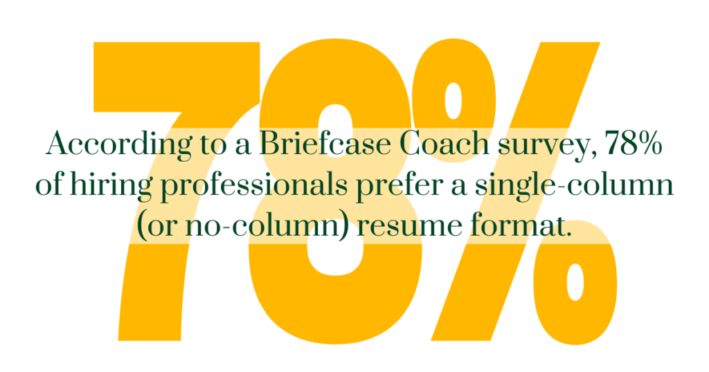
This overwhelming preference for no-column resumes among readers offers critical insights for job seekers. Despite the visual appeal and modern aesthetic often associated with multi-column designs, the vast majority of recruiters and hiring managers prefer the simplicity and straightforwardness of the traditional no-column format.
Why this strong preference? Several factors likely contribute to this inclination:
Readability and Flow: As discussed, the linear progression of a no-column resume allows for a natural, uninterrupted reading experience. Recruiters, often sifting through hundreds of applications, appreciate a document that is easy to scan and digest quickly. Divided columns, even if aesthetically pleasing, can introduce a slight cognitive load as the reader’s eye has to jump between sections or determine the intended reading order.
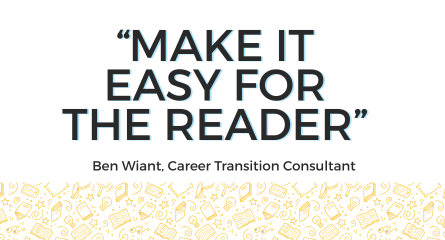
Ben Wiant, Career Transition Consultant at 3 Doors Job Search, points out that it “is worth noting that recruiters, HR, and hiring managers are often reviewing dozens if not hundreds of resumes in a sitting. Forcing them to seek out information in unexpected places in a novel (ie, 2-column) format slows them down, and they may miss important information as they scan it for the first time. Make it easy for the reader.”
Efficiency: Time is a precious commodity for recruiters. A resume that presents information clearly and concisely, without requiring extra effort to decipher the layout, allows them to efficiently extract the most relevant details. The less mental effort required to navigate the document, the more focus can be placed on the actual content. The traditional no-column approach aligns with natural reading patterns.
As Scott Gardner, Executive Resume Writer & Interview Coach at Vitae Express, points out, “People naturally read left to right. When a resume breaks that flow with columns, it disrupts the quiet rhythm our eyes expect and makes the story harder to absorb.” This highlights how the no-column format can contribute to a smoother, more intuitive reading experience for recruiters.
ATS Compatibility: While not directly a “reader preference” in the human sense, the underlying knowledge or experience with ATS issues likely influences this preference. Recruiters know that if a resume is difficult for their systems to parse, it might not even reach their desk, or if it does, it might be incomplete or poorly formatted. Therefore, a format that is reliably ATS-friendly is inherently preferred.
Rhys Dowbiggin, Content Marketing Specialist at Jobscan, emphasizes, “The answer is: whatever is parsed in an ATS. And that would be ‘no columns.’ If your resume can’t be read by an ATS, your resume is a tree falling in the woods with no one around to hear it.” This underscores the critical role of the no-column format in ensuring a resume is effectively processed and seen by recruiters.
Professionalism and Seriousness: For many, the no-column resume signals a more traditional, professional, and content-focused approach. It suggests that the job seeker is prioritizing the substance of their qualifications over potentially distracting design elements. While a well-designed two-column resume can look sophisticated, a poorly executed one can appear cluttered or unprofessional.
“I find that two-column resumes leave less room for the important information (e.g., experience and accomplishments) than a no-column resume and they put too strong an emphasis on the fluff (e.g., lists of skills, skill scales, design for the sake of design),”
– Angela Watts, Former CEO and Executive Resume Writer at MyPro Resumes & Recruit.
Consistency: Recruiters review countless resumes from diverse backgrounds and industries, and a consistent, predictable layout allows them to quickly orient themselves and locate information without having to adapt to a new design scheme for each applicant. As Gina Riley, Career Coach at Gina Riley Consulting, explains, “While summer recruiters might get bored of looking at the same style over and over, for me, it’s easier for my eye to skim over a no-column versus having to dart my eyes all around the document. If I need to skim 800 resumes, I need the information to be spoonfed to me.” This highlights how the straightforward nature of the no-column format aids in efficient and rapid resume review.
Implications for Job Seekers
The survey results provide a clear directive for job seekers: when in doubt, opt for a no-column resume. While multi-column designs may appear visually appealing and modern, they are significantly less preferred by the individuals who hold the power to hire.
This doesn’t mean that multi-column resumes are inherently “bad” or will always lead to rejection. There might be specific industries (e.g., graphic design, creative fields) where a more visually striking or unconventional resume design is not only accepted but even expected. However, for the vast majority of professions, particularly in corporate, technical, and traditional sectors, adhering to the no-column format is the safer and more effective choice.
Key Considerations When Choosing a Layout:
Testing: If unsure, consider A/B testing if possible. Send out both versions and track which one yields more responses. However, this is often impractical for individual job seekers. A simpler approach is to get feedback from trusted mentors or career coaches who have experience reviewing resumes.
Industry and Role: Research the norms for the target industry. If applying for a highly creative role, a more visually interesting resume might be appropriate. For most other roles, stick to conventional layouts.
ATS Compatibility: Prioritize ATS-friendliness. If it’s known that a company uses an ATS, a simple, no-column layout with standard headings is the best bet to ensure the resume is parsed correctly.
Readability: Regardless of columns, the primary goal is readability. Use clear fonts, appropriate font sizes, and ample white space to avoid a cluttered appearance.
Content is King: Remember that the layout is merely the vehicle for content. No matter how aesthetically pleasing a resume is, it won’t compensate for weak or irrelevant information. Focus on crafting compelling bullet points that highlight achievements and quantify results.
Personal Preference (within reason): While the survey leans heavily towards no-columns, if a candidate genuinely believes a two-column design highlights their unique qualifications better and has researched that it’s acceptable in their target industry, they might consider it. However, they should proceed with caution and always have a no-column version ready.
Best Practices for a No-Column Resume
Even within the no-column format, there are best practices to ensure a resume stands out and effectively communicates a candidate’s qualifications. First and foremost, clarity and readability are paramount. Job seekers should use clear, bold, and legible headings like “Experience,” “Education,” and “Skills” to precisely delineate each section. For both work experience and educational background, it’s crucial to list the most recent entry first, adhering to a reverse chronological order. When describing responsibilities and achievements, candidates should opt for action-oriented bullet points and, critically, quantify accomplishments whenever possible. Instead of just saying “managed projects,” illustrate impact by stating “Managed a team of 5 and successfully delivered 10 projects on time and under budget.” The more detailed and precise candidates can be about the specific results and accomplishments they’ve professionally achieved, the better.
Beyond content, presentation plays a crucial role. Candidates should strive for conciseness, avoiding unnecessary jargon or overly long sentences, even though the no-column format offers more space. Strategic use of white space around text blocks is essential; it prevents the resume from appearing cluttered and makes it significantly easier on the eyes. Integrating relevant keywords directly from the job description naturally throughout the resume is also crucial for improving ATS (Applicant Tracking System) matching and ensuring the resume gets seen by human recruiters.
Candidates should also choose a professional, easy-to-read font such as Arial, Calibri, or Times New Roman. For early to mid-career professionals, a one-page resume is generally preferred, demonstrating the ability to distill the most relevant experience concisely. However, for individuals with extensive experience spanning many years, a well-structured and clearly organized two-page resume is perfectly acceptable. Adhering to these practices will help job seekers craft a highly effective no-column resume that appeals to both human recruiters and ATS.
Choosing Your Resume Layout: Simplicity Wins
The initial decision of resume layout can feel daunting, but the insights from reader preferences offer a clear path forward. While resume builder tools might tempt job seekers with sleek, multi-column designs, the overwhelming majority of recruiters and hiring managers prefer the straightforward simplicity and readability of a no-column resume. This preference is rooted in efficiency, ease of parsing by ATS, and a perception of professionalism.
By opting for a traditional, linear layout, job seekers significantly increase their chances of having their resume accurately read by both machines and humans. Ultimately, the most effective resume is one that allows the content to shine through, clearly articulating qualifications and accomplishments without any visual distractions or navigational hurdles. By focusing on crafting compelling content within a classic, clean format, job seekers will be well on their way to making a strong first impression.